


To get the best from your session it is important to consider what look you want to achieve. The best results come from a carefully planned combination of things and the clothes that you wear can make a significant difference to the end result. Aim for a co-ordinated palette of colours whether you are having an individual portrait session or a family session. You don't have to be overly formal (unless that is the look you are after) and certainly don't need everything to be an exact match, but do look for a point of consistency, particularly so that in group sessions you look like you belong together.
Here are a few more things to think about:
-
Co-ordinate the style of everyone who will be included in your images and try to think about your clothing from head to toe. Make sure everything ties together both in style and colour i.e. a long dress may not fit alongside jeans and a tee-shirt. You should also try to ensure that your outfit(s) will work in full-length just as well as they do for head-shots. If you start with a single colour it can provide a point of consistency to set an similar tonal range. It may help if this is a neutral colour (such as black, white, grey, brown, beige). As neutral colours are not part of the colour wheel (see below) they can be very helpful because they don't tend to clash or over dominate each other.
 NeutralsBrown, beige, white, grey and black will provide a good basis for a more subdued look that can be readily accented with splashes of brighter colours if you wish.
-
If you choose a neutral palette you may also want an accent colour, a small amount of a bright colour for a punchy look, this can often be achieved with accessories such as scarves and hats or even more unusual things like umbrellas. Stronger colours or patterns can be used to for accent items so that they are not too dominant. Or, you might prefer a more subtle accent that is balanced against neutral colours as with the dark blue, beige and cream example below.
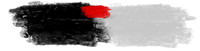 Accented coloursAccented colours can create a punchy look with relatively minor amounts of additional colour. Here Red has been used to accent a base of black and grey.
 Accented colours 2Accented colours can also be used in equal measure but will look better if toned down to suit. In this example a dark Blue has been added to two neutrals based on brown and beige.
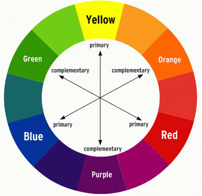 Colour wheel
-
If you decide to go for a colourful look try to think about the balance of colours. It can help to choose "complementary" colours (opposites on the colour wheel); "split-complementary" colours (either side of the opposite colour, e.g. Red-purple and Blue-purple for Yellow) or "analogous" colours (colours that are next to each other on the colour wheel e.g. green, green-Yellow and green-Blue).
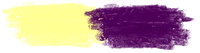 Complementary coloursComplementary colours showing a light yellow with a rich purple in equal measure.
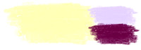 Split complementariesSplit complementaries can increase the range of the palette without clashing. Here yellow is augmented with a light Blue-purple and a darker Red-purple.
 Analogous coloursAnalogous colours are selected from the colour wheel in sequence. Here Blue-green is followed by green and Yellow-green. This approach can work with more colours but four or five is a good place to stop.
-
You may decide that you want a monochromatic look, which is based on a single colour palette, such as navy blue, sky blue and blue-grey (similar but not necessarily analogous).
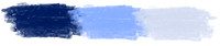 Monochromatic coloursMonochromatic colours are based on the same base colour, in this instance a navy blue, a sky blue and a blue grey. All are adjustments in tone from the Blue primary colour.
-
Try to keep the tonal ranges similar for everyone in the images. Simple, solid colours are best (large bold patterns and logos will draw attention away from the face and look messy). Be aware that darker colours tend to minimise body size and lighter ones have the opposite effect. Lighter clothing and pastel colours will also look good against a white backdrop if we are shooting in studio conditions. Necklines are also important and can change your appearance dramatically, for example, open neck tops are better for shorter necks and fuller faces.
-
Consider the season, some colours work better at certain times of the year e.g. rust, brown and beige won't look so good in spring but will look great at autumn so be prepared to dress for the season as well as the image but don't simply dress for the weather. You may want a very specific seasonal look (it doesn't have to be winter to be in coats, hats and scarves) but don't forget it is a lot more pleasant having your pictures taken if the weather is mild whatever you are wearing and summer clothes don't mix well with snow!
-
Do plan to have more than one outfit available for everybody, this is a good way to give yourself options if you are planning to buy group and individual images or to create variety for an album.
-
It is always worthwhile having some things available that tell your story and portray something of who you are, such as favourite toys for the kids.
Finally, you should consider precisely where you might want to hang your images, what works in the hall may not suit a bedroom:
-
Room colours may lead you towards particular colour choices whether to complement or contrast your wall colours.
-
You may also want to consider framing options and alternatives such as canvasses that are not framed to determine in advance what you are looking for on your wall (click here for example room settings to help you think about this).
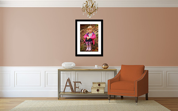 Armchair displayAn example of a 30x20 image with a 2" frame and 3" mat surround.
Although this may seem like a lot to take into account, thinking it through in advance can make all the difference in getting exactly what you are hoping for out of your session.